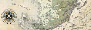
Wow, these shaded relief mountains look absolutely amazing in my view!I also like the border elements and the title a lot (good job on the "R" ). The dark water lets the land with the fine mountains shine even more. Keep up the great work kacey!

I got my water in this afternoon, it was really hard to get a colour that worked. I also did allot more work on the mountains, there not quite done but almost, and I changed the border colour a bit, used the light purple with a slight overlay of the rust, and a light version of the rust for the highlights, it stands out better against the land colour now. I did the tail on the R by hand, it's not perfect but I don't know how to do vectors so it's the best I could do. I really wish reducing the size, and changing it to JPEG didn't muck things up so much, it looks much better in the original file, but I guess there's not much I can do about that.
### Latest WIP ###

Last edited by kacey; 09-12-2016 at 03:09 PM.
Wow, these shaded relief mountains look absolutely amazing in my view!
Map is not territory...
Current work in progress:Korobrom | My finished maps
My DeviantArt site and Twitter


Love your border, only comment is that the page fold doesn't effect the border, but should?. Beautiful color and can't say enough about the border, you're not far off with the tail of the R. your landforms are beautiful!
Thanks Abu Lafia, I appreciate the kind words.Originally Posted by Abu Lafia

Thank's Snodsy, I'm not sure I'm even going to keep the folds, I'm partial to this texture, but I'm unsure of weather it really fit's. I may remove the folds, not sure yet what I'm doing there.
I'm so glad you like the border it's reassuring, I spent allot of time trying to get clean lines by hand so I'm glad it's working out, tho I think if I knew how to use something like Inkscape, or Illustrator the border would look much cleaner. I think if I ever do anything like this again I'll have to give those programs a go.
Thank's for the Rep comment Carbus, I really appreciate it.
I love the overall color of the map, the dark seas are great !
Wow, what a difference since I last checked in! The sea colour is very striking and I love the title.
"We are the music makers, and we are the dreamers of dreams"
Thank's ChickPea, and Thomrey, I'm so glad you like the dark sea colour. I struggled allot to work it out with this palette, and spent about three hours getting the title right so the nice comments mean allot to me, and help me to keep going.
I added some very faint rivers, I used a mix of the rust colour, and the pink with white. They still need major work. I tried using the purples, and the dark rust but they were hideous, and destroyed the look of the terrain, so I thought Id try and make them look as tho theyd been carved out of the ground...Im not so sure about them.
I also added a legend box, it still needs work on the inside edges, and I made up some symbols. I added a few to the border instead of the nails, and Im happy with how they turned out.
I also put in some major region names, I didnt want them to stand out to much, and I wanted them to be seated into the terrain, and I think I achieved that. I used the same light purple with a bit of rust like the border, the layer styles, and black, and white texture are whats making it look a little greyish and metallic.
I also worked on the terrain a little more. Theres still allot to do. I hope to get to work on some labelling next, Im definitely borrowing names from the other map Im working on...I hope thats OK.
### Latest WIP ###

 Posting Permissions